
July to December 2023
Oshepro EHS Platform
UX Designer · Oshepro
UX Designer (July to December 2023), remote with a Phoenix team. Figma, prototypes, and UI documentation for three EHS modules used by non-technical field and safety teams in North America. This was UX design work, not software engineering or frontend implementation.
Overview
July to December 2023. Remote from Sydney with a team based in Phoenix. Oshepro is an EHS platform for safety audits, risk assessments, and compliance reporting. Users are non-technical field and safety teams in North America who need to log hazards and close out tasks, then get back to work.
My role was UX design only: Figma, prototypes, and UI documentation. I reviewed existing product workflows and user reviews. I did not conduct direct user interviews or shadow field teams, and I did not implement frontend code. Incomplete forms in this product create audit and safety risk, so clarity mattered more than visual polish.
I worked on three modules: SHEMa (Safety, Health and Environmental Manager), AMLA (Accident Management and Loss Analysis), and TRACI (Task Risk Assessment, Control and Implementation).
The problem
People were fighting the interface. Navigation changed across modules, similar controls behaved differently, and common tasks took too many clicks. User reviews said the product was easy for some users and too complicated for less technical ones. Missed required fields and half-finished records were a data quality problem with real compliance consequences.
SHEMa
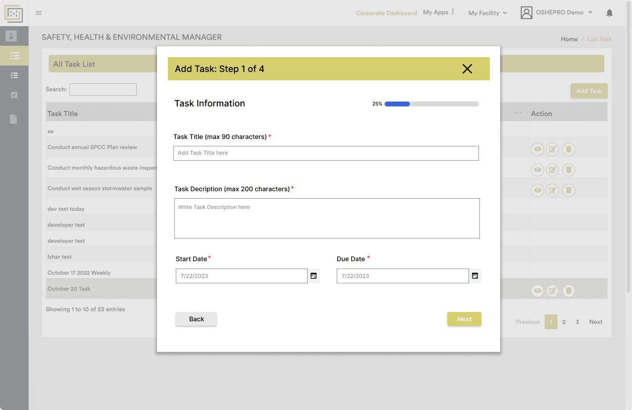
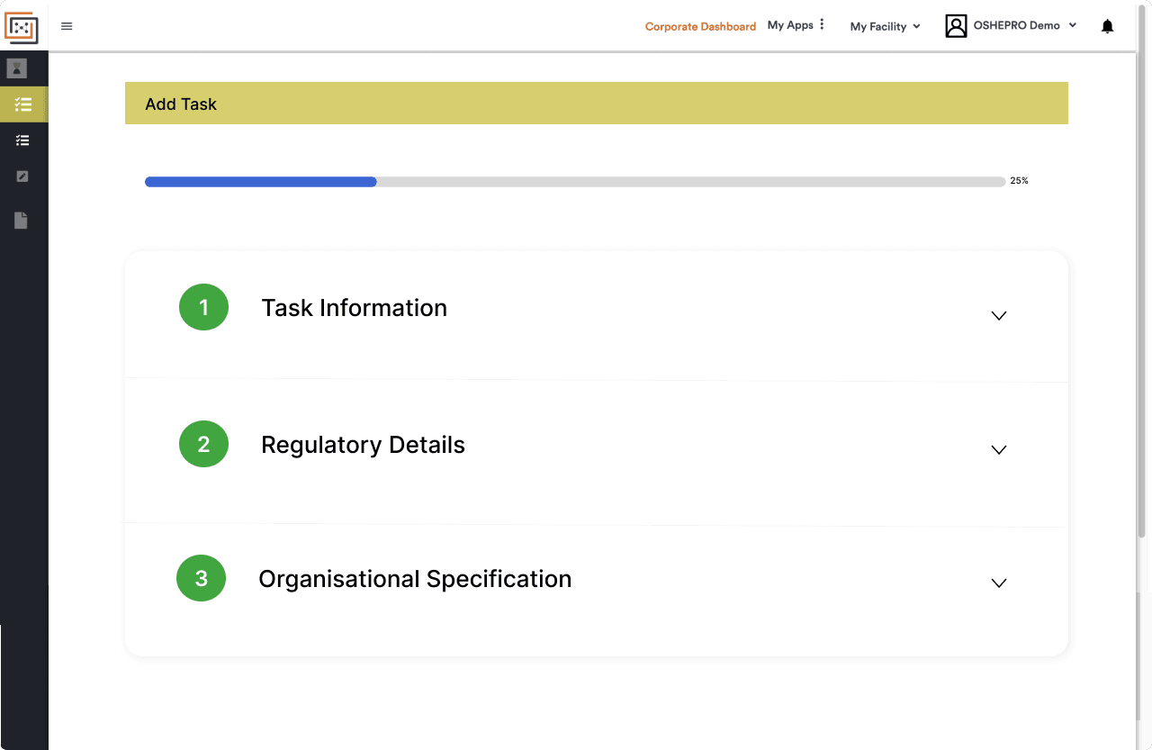
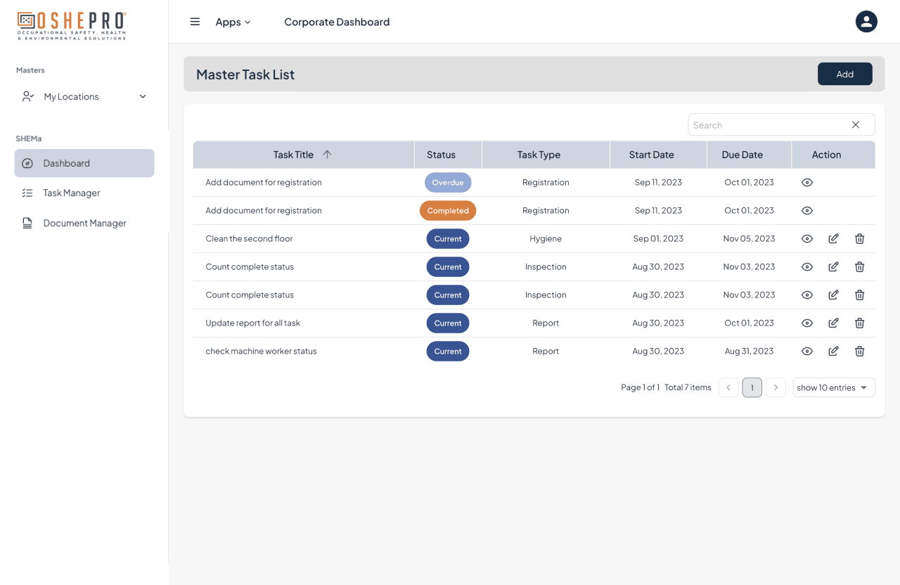
SHEMa was the module people touched most. I designed two competing flows, including accordion layouts, sticky navigation, colour-coded status, and standardised patterns, then pushed a clearer direction. Single-page layouts in these deliverables were design specifications, not implemented features.
- Next and Back behaviour was easy to misread, so people thought they had finished when they had not.
- Entered text looked too similar to placeholder text.
- After creating a task, return to the task list was unclear.
- Small click targets and inconsistent permission visibility on the task list.
AMLA
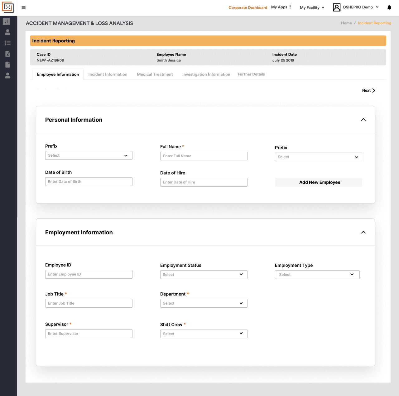
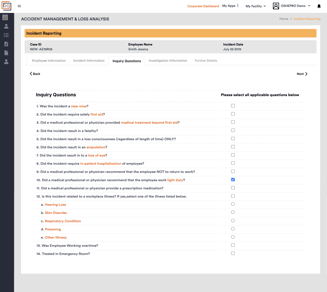
AMLA asked for important incident information, but the UI made people work too hard before they could focus on the incident. I simplified it into a more linear, consistent flow with clearer section hierarchy and standardised inputs.
TRACI
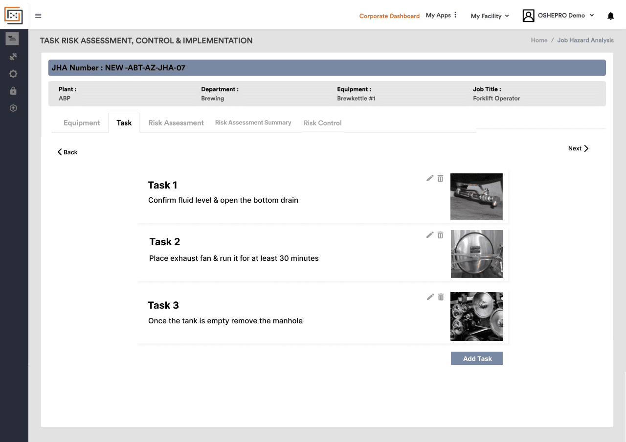
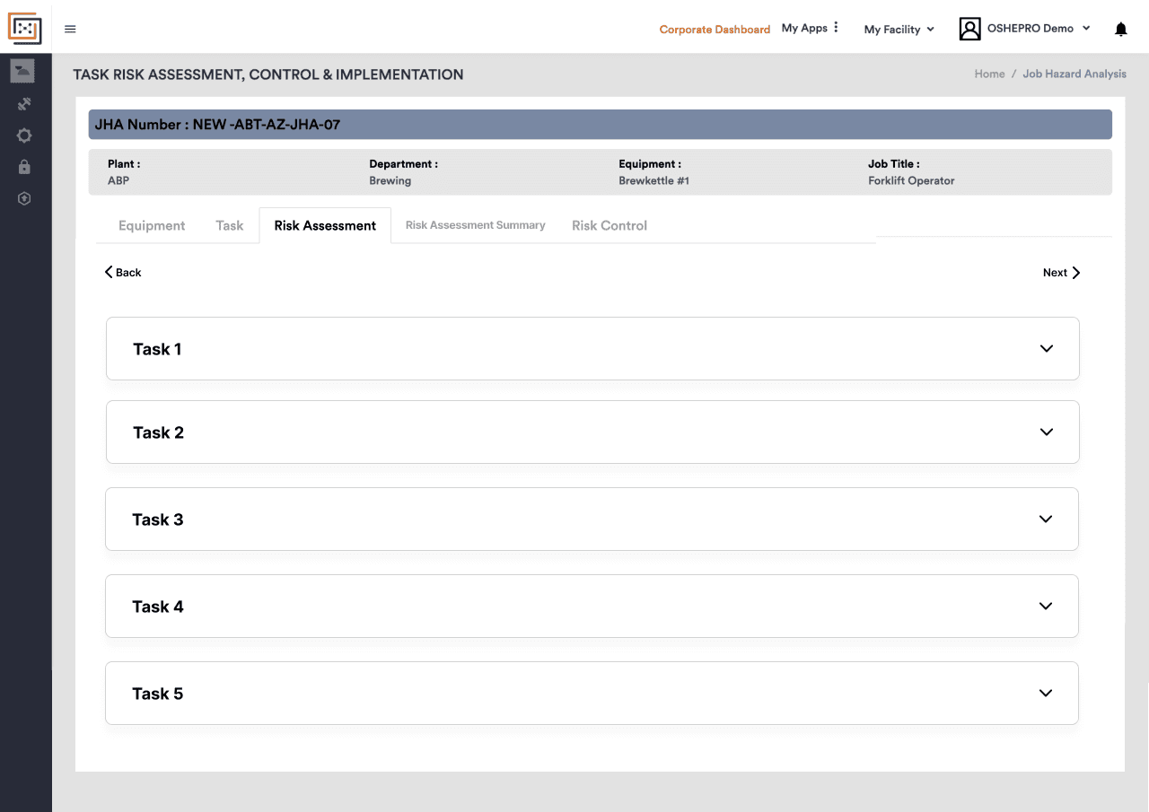
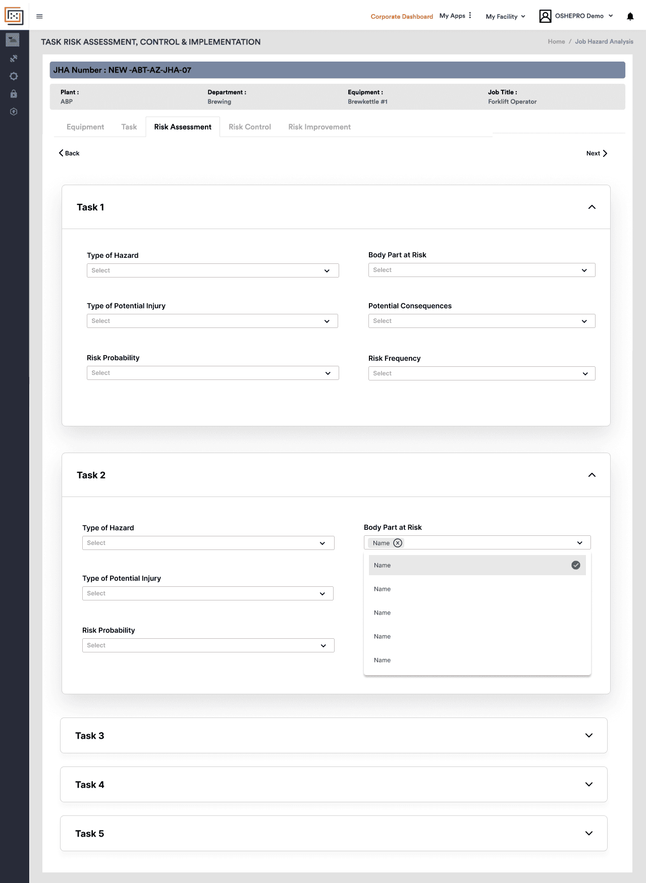
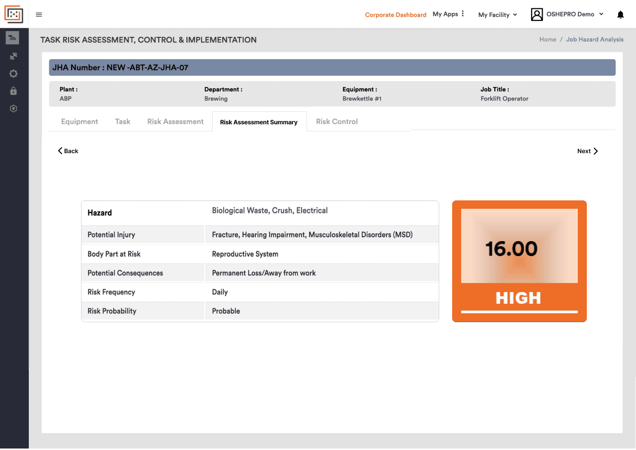
TRACI is the most complex module. Hazard screens were dense and nested. I restructured it into clearer task-level sections, cleaned up checklist interactions, and used colour-coded severity so high-risk items stand out during review.
What I took away
In compliance products, design is about helping people enter the right information at the right time. This experience sits beside my engineering work as product thinking and UX ability, not as software implementation experience.